 Kasey Kelly
Sometimes a URL only exists to be printed. Consider the "print" button on a recipe website. Strictly speaking you just need @media print { ... } styles for the whole page. Often though, there's an intermediate step before the printer where the document is displayed in the browser. Styling this page like a mock version of the printed document is helpful UX for the user, and is helpful when you're actually building the print styles too.
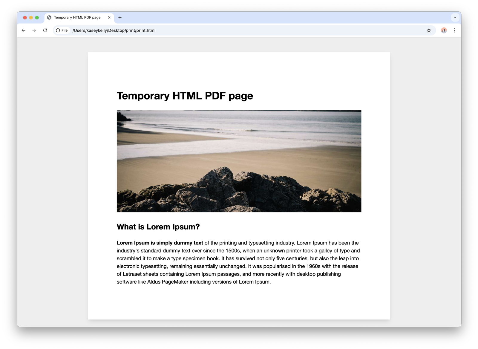
See the end result:
First, a .page-wrap element is used with a max-width set to 8.5in, which is the standard size for American printer paper. (Inches are completely valid CSS! 🇺🇸) A margin, box shadow, and white background is also added here, on top of a light grey background on the body element:
body {
  background: #eee;
  box-sizing: border-box;
  font: 13pt/1.5 "Helvetica Neue", Helvetica, Arial, sans-serif;
}

.page-wrap {
  padding: 1in;
  max-width: 8.5in;
  margin: 0.5in auto;
  box-shadow: 0 10px 15px -3px rgb(0 0 0 / 0.1), 0 4px 6px -4px rgb(0 0 0 / 0.1);
  background: #fff;
}
Then, those styles are removed with the print media query:
@media print {
  body {
    background: #fff;
  }

  .page-wrap {
    padding: 0;
    margin: 0;
    box-shadow: none;
    max-width: none;
  }
}
Finally, add margin to the @page element within the print CSS to match the preview:
  @page {
    /* let the printer actually choose the paper size */
    size: auto;
    /* This affects the margin in the printer settings. Match the
       padding value in `.page-wrap` for an accurate preview. */
    margin: 1in;
  }
It's not a perfect representation because the printer and the screen renders fonts slightly differently, and actual print settings are sometimes overriden by the OS or the browser.
Here's the full final code:
<!DOCTYPE html>
<html>
  <head>
    <meta charset=utf-8>
    <title>Temporary HTML PDF page</title>
    <meta content="width=device-width, initial-scale=1" name=viewport>
    <style>
      body {
        background: #eee;
        box-sizing: border-box;
        font: 13pt/1.5 "Helvetica Neue", Helvetica, Arial, sans-serif;
      }

      .page-wrap {
        padding: 1in;
        max-width: 8.5in;
        margin: 0.5in auto;
        box-shadow: 0 10px 15px -3px rgb(0 0 0 / 0.1), 0 4px 6px -4px rgb(0 0 0 / 0.1);
        background: #fff;
      }

      img {
        max-width: 100%;
      }

      /* remove the browser helper css from above */
      @media print {
        body {
          background: #fff;
        }

        .page-wrap {
          padding: 0;
          margin: 0;
          box-shadow: none;
          max-width: none;
        }

        @page {
          /* let the printer actually choose the paper size */
          size: auto;
          /* This affects the margin in the printer settings. Match the
            padding value in `.page-wrap` for an accurate preview. */
          margin: 1in;
        }
      }
    </style>
  </head>
  <body>
    <div class="page-wrap">

      <h1>Temporary HTML PDF page</h1>
      <img src="https://picsum.photos/1200/500"/>

      <h2>What is Lorem Ipsum?</h2>

      <p>
        <strong>Lorem Ipsum is simply dummy text</strong> of the printing and typesetting industry. Lorem Ipsum has been the industry's standard dummy text ever since the 1500s, when an unknown printer took a galley of type and scrambled it to make a type specimen book. It has survived not only five centuries, but also the leap into electronic typesetting, remaining essentially unchanged. It was popularised in the 1960s with the release of Letraset sheets containing Lorem Ipsum passages, and more recently with desktop publishing software like Aldus PageMaker including versions of Lorem Ipsum.</p>

    </div>
  </body>
</html>